SimplePractice Calendar: Custom Color Tagging for Appointments and Events
Want to skim through this case study? I got you covered.
Here's a 1 min TL;DR version.
Led the design and implemention of a custom color-tagging feature for the events flyout in the SimplePractice calendar, improving event categorization and user clarity.
HealthCare Industry - Practice Management Software
3 months
Product Manager
Project Lead (Me)
Senior Product Designer
Engineering Team - 6 people
Marketing Team - 3 people
✅ Shipped 2026
what did i do?
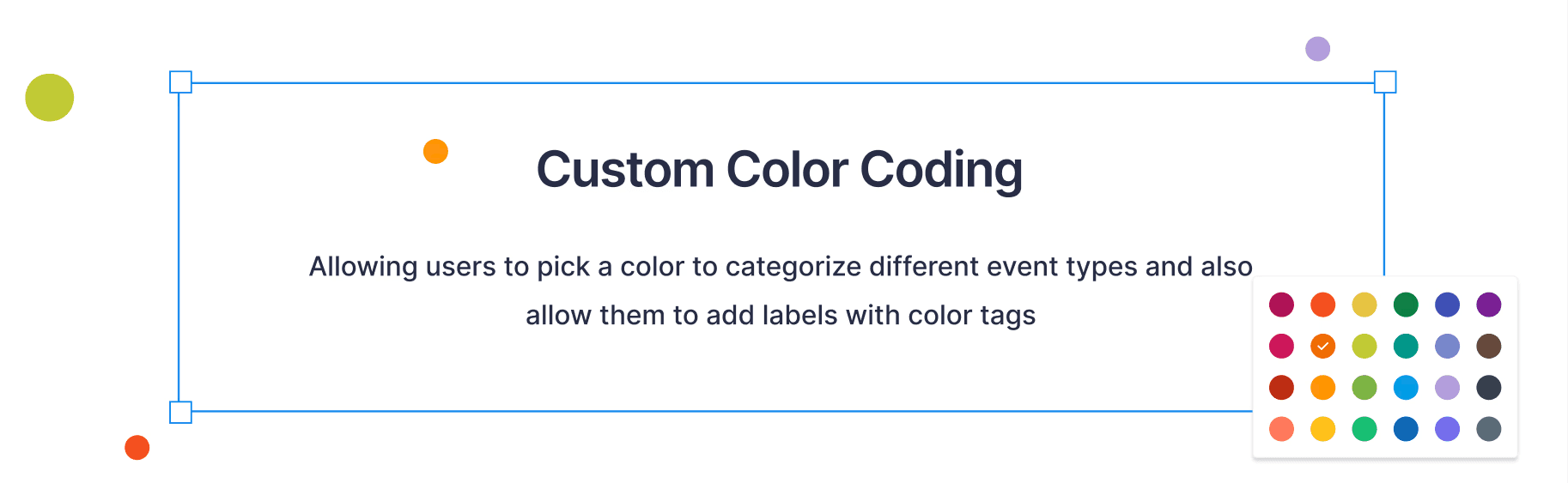
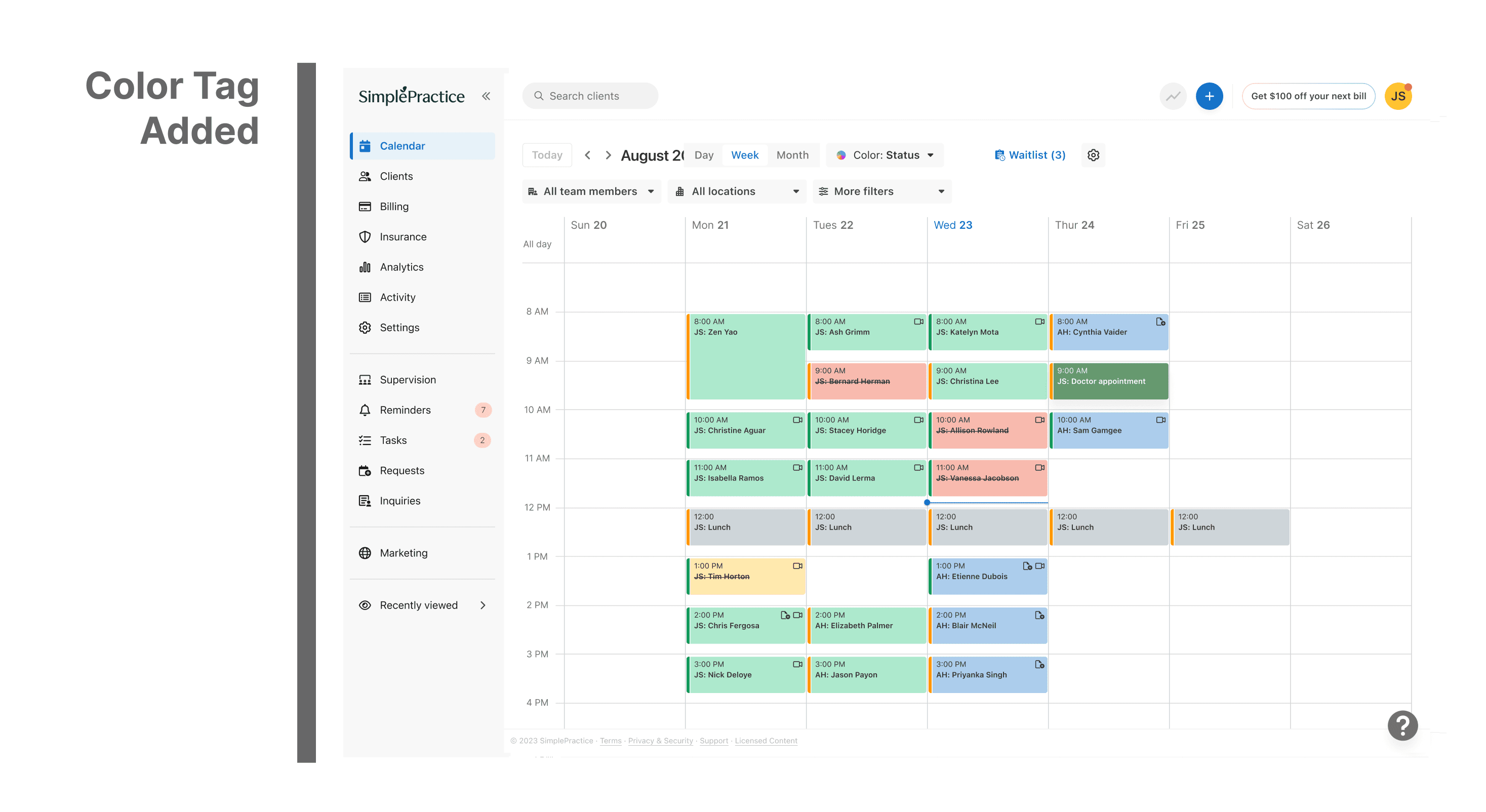
To help users quickly distinguish between different event types, I introduced a custom color-tagging system to the calendar’s events flyout, making scheduling more intuitive and visually organized.
why was it done?
To make scheduling more intuitive for clinicians and clients by reducing visual clutter, improving calendar readability, and allowing faster recognition of event types.
the impact?
Improved scalability by 45% to improvise workflow for 250,000+ users nationwide and impacting 125M+ appointments scheduled annually.
what did i learn?
Learned how small visual cues can transform user workflows, and how to balance functionality with aesthetic simplicity to create a seamless, color-accessible interface.
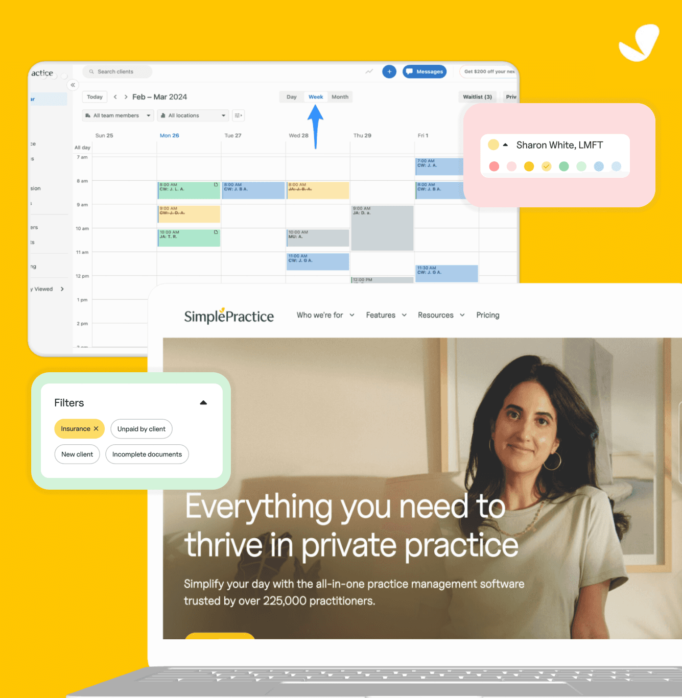
About Simple Practice Calendar:
The SimplePractice Calendar is used by therapists, clinicians, and wellness professionals to schedule, manage, and track client appointments, all in one place within their EHR platform, accessible on both web and mobile.
16M+ clients
Voted #1 EHR Software of the year
225,000+
Practioners Listed as of 2025
95 million
therapy sessions attended/delivered
what was the problem?
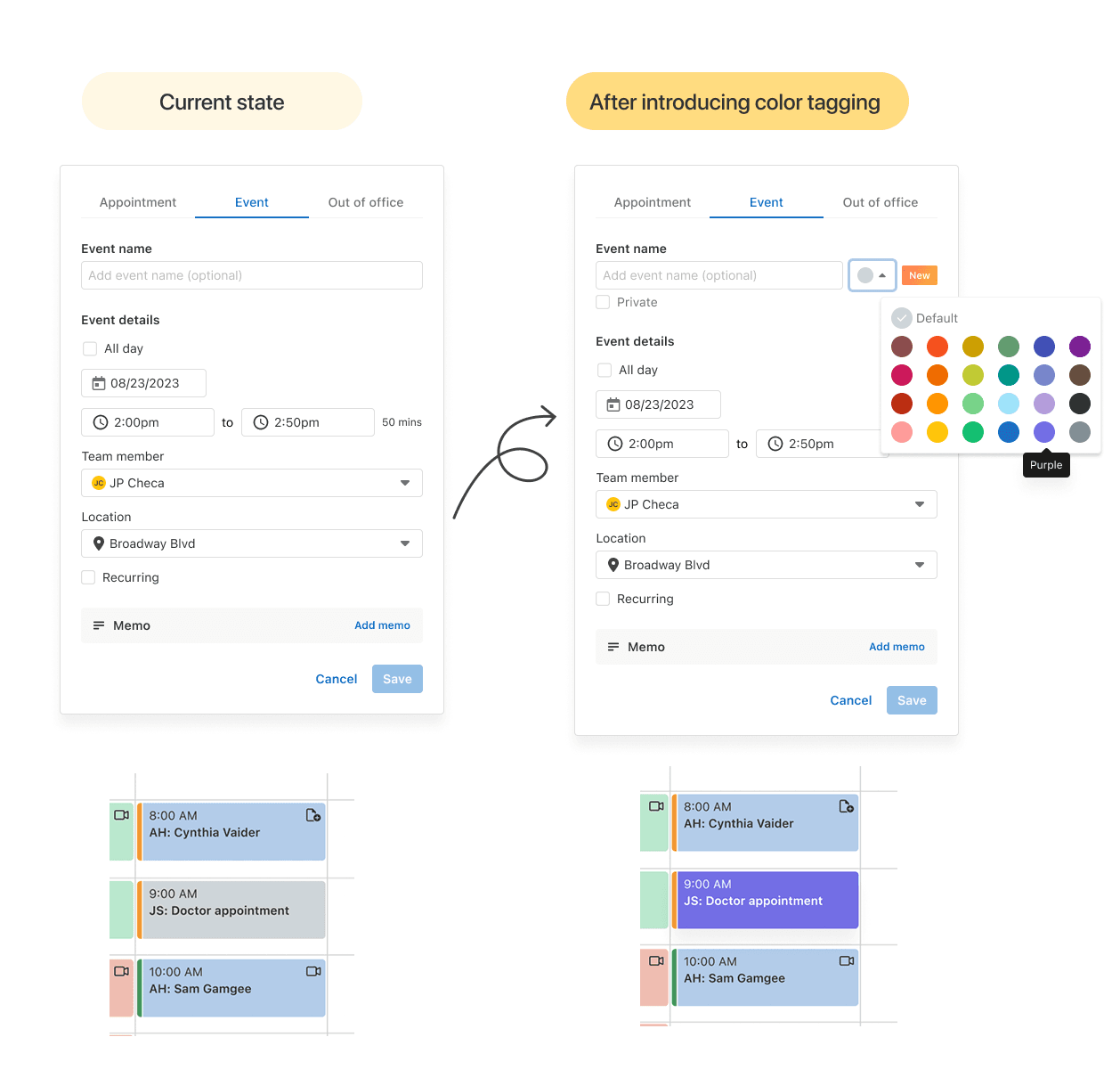
Originally, all events in the calendar appeared in a uniform grey color, regardless of type or purpose. While functional, this design made it hard for users to quickly distinguish between sessions, personal events, cancellations, or reminders, especially when managing packed schedules.
Users often mentioned that the calendar felt “monotone” and “visually heavy,” forcing them to rely on text instead of quick color cues.
so then we decided to solve this by…
Making the calendar visually intuitive by enabling users to categorize and identify event types at a glance reducing cognitive load and improving scheduling efficiency.
process at a glance:
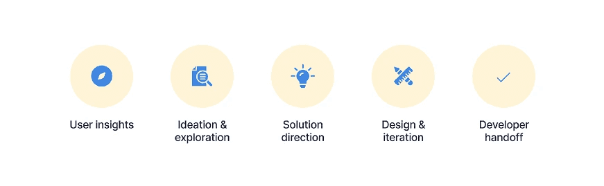
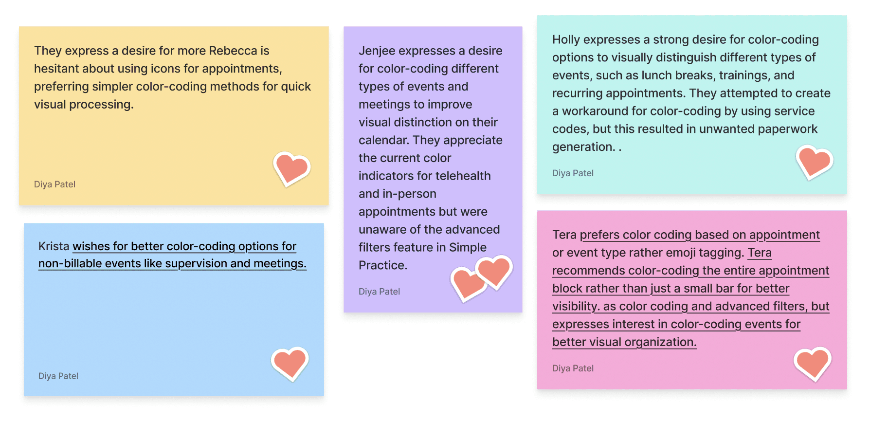
User insights - Reviewed user feedback and customer support reports highlighting confusion with event differentiation.
Ideation & exploration — Explored various approaches such as icons, labels, and color cues.
Solution direction — Chose custom color tagging as it offered flexibility while maintaining calendar cleanliness.
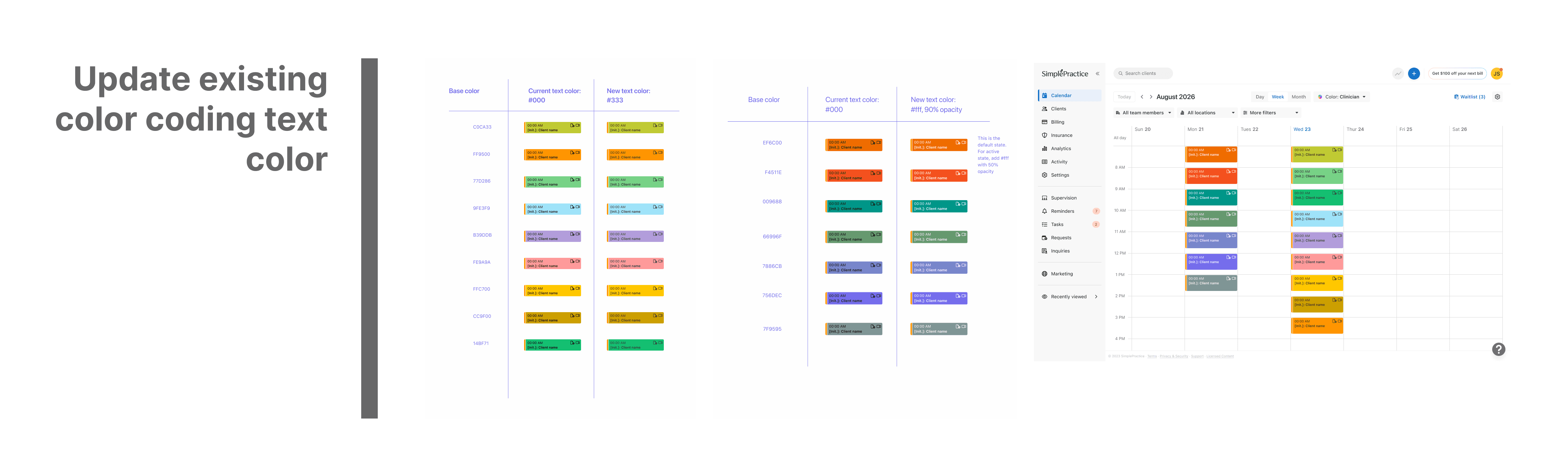
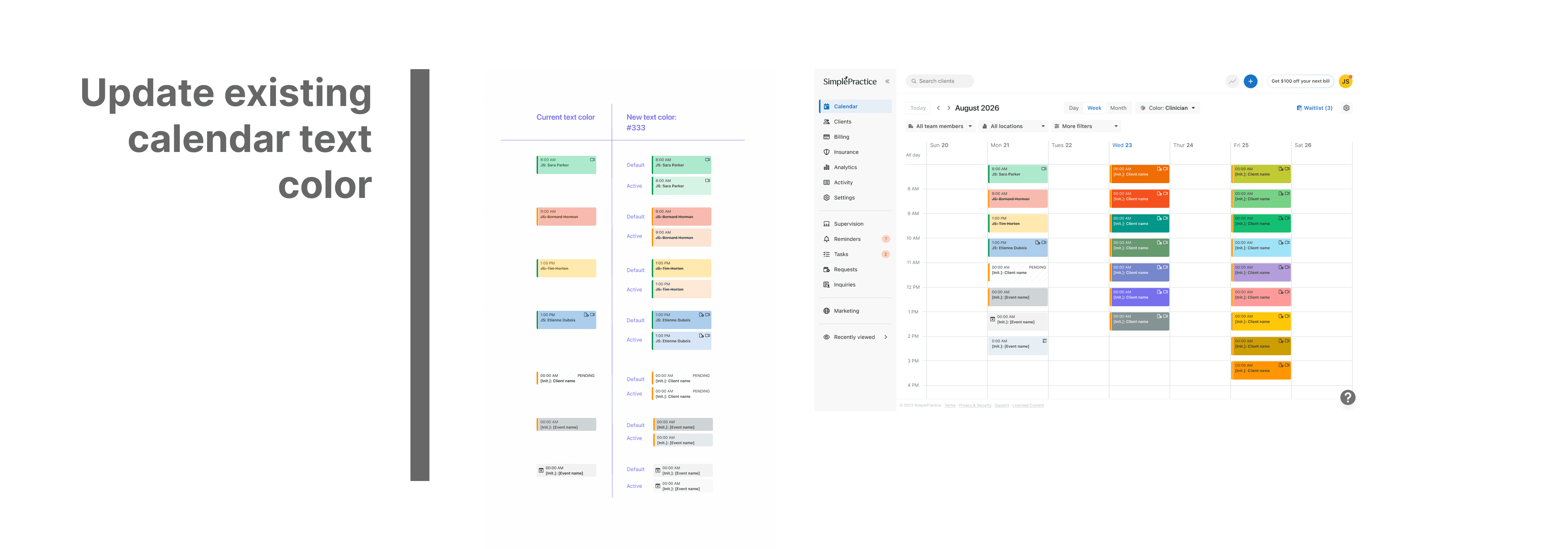
Design & iteration — Prototyped and tested color combinations to ensure accessibility and alignment with the brand palette.
Developer handoff — Created scalable design tokens and documentation for consistent implementation.
Interviews and Ideation
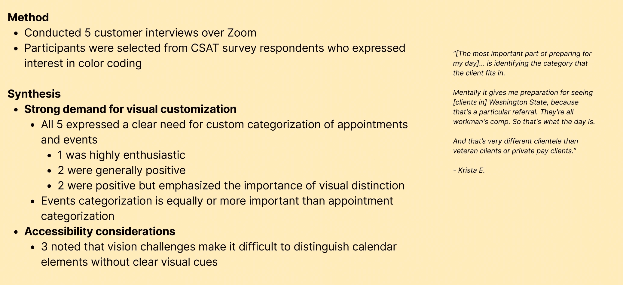
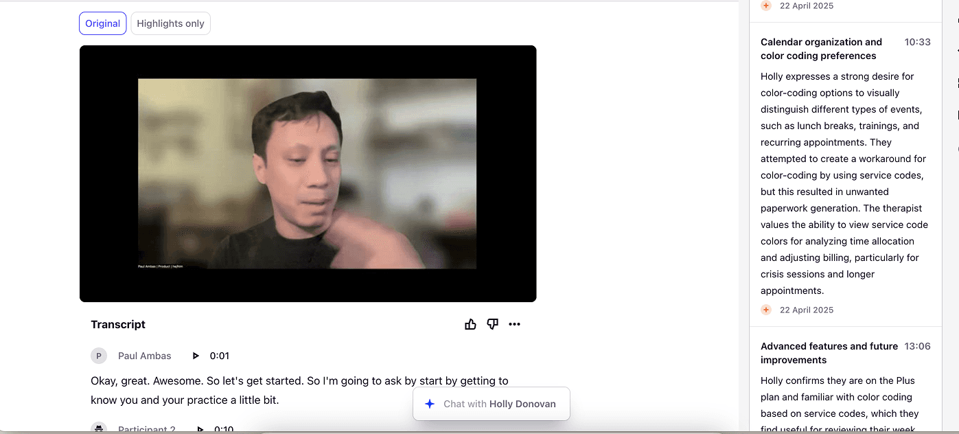
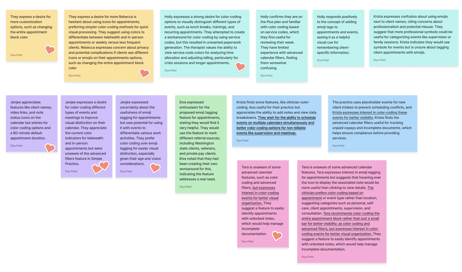
During ideation phase, we realised 2 potential solutions -
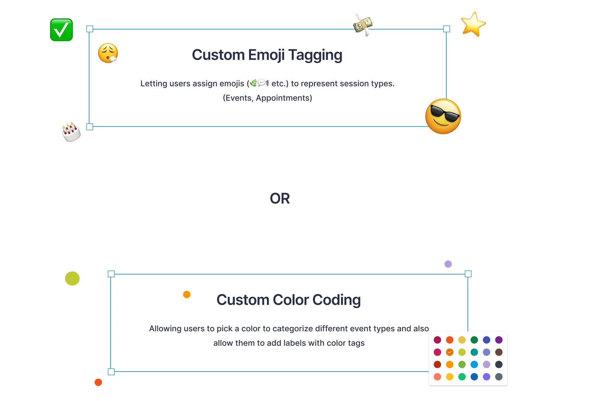
Did some quick prototypes for emoji tagging and tested it with few users
User testing : Emoji Tagging felt fun and expressive, but testers found it inconsistent and harder to scan at a glance.
Users preferred color tagging over emojis for its clarity and consistency, so we moved forward with the color-based solution.
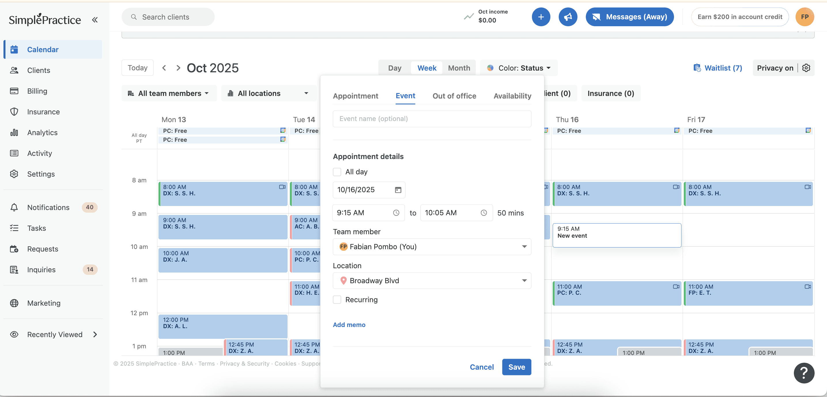
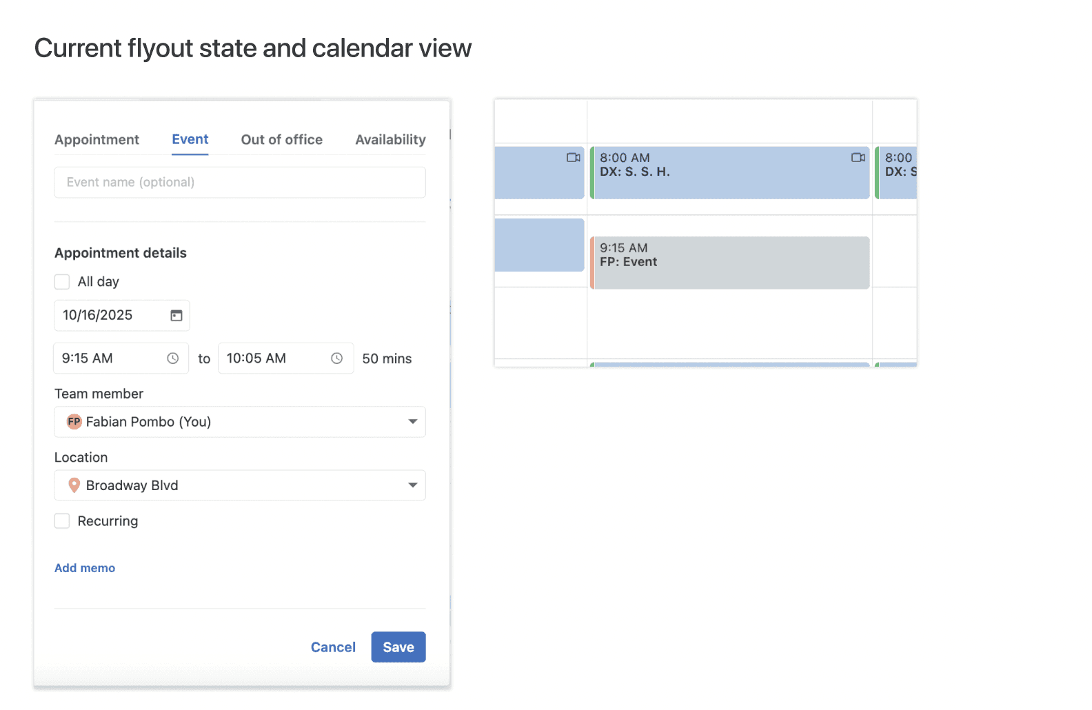
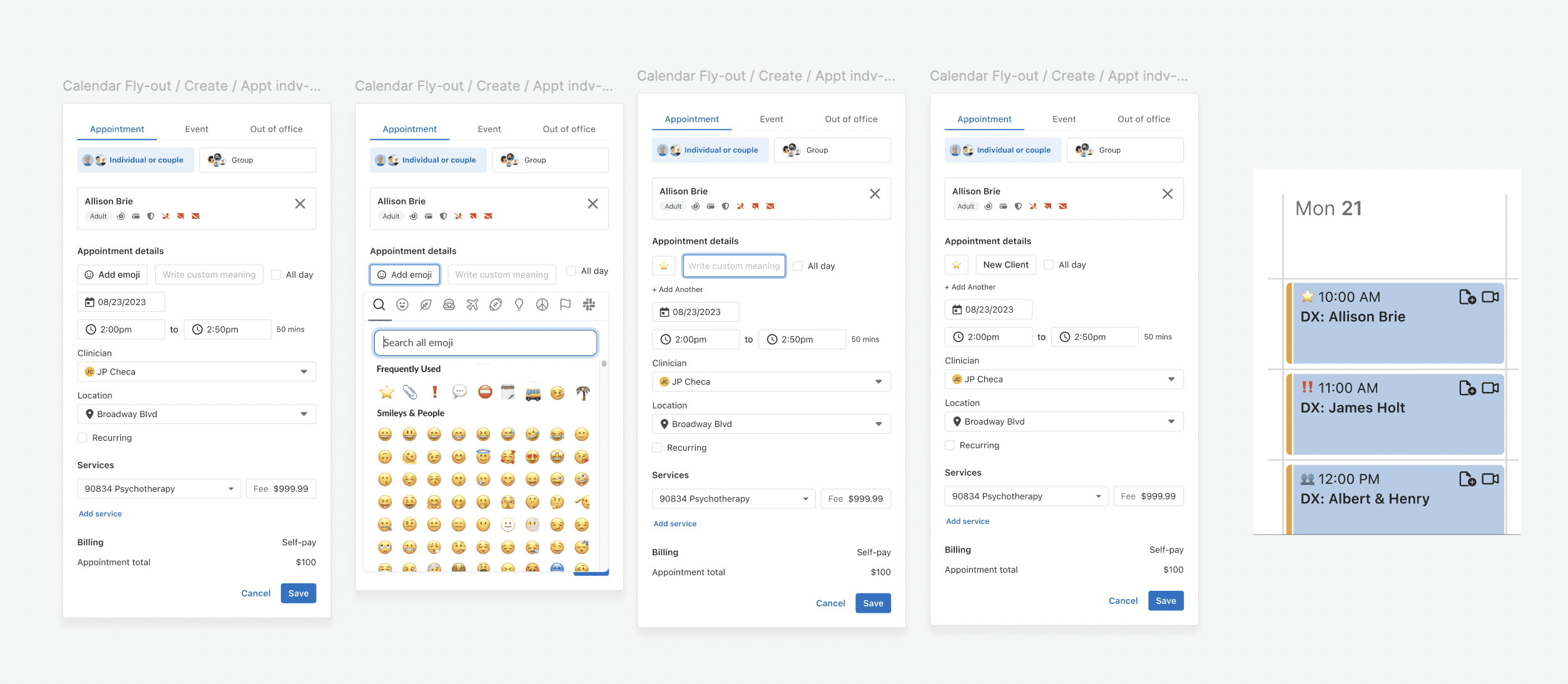
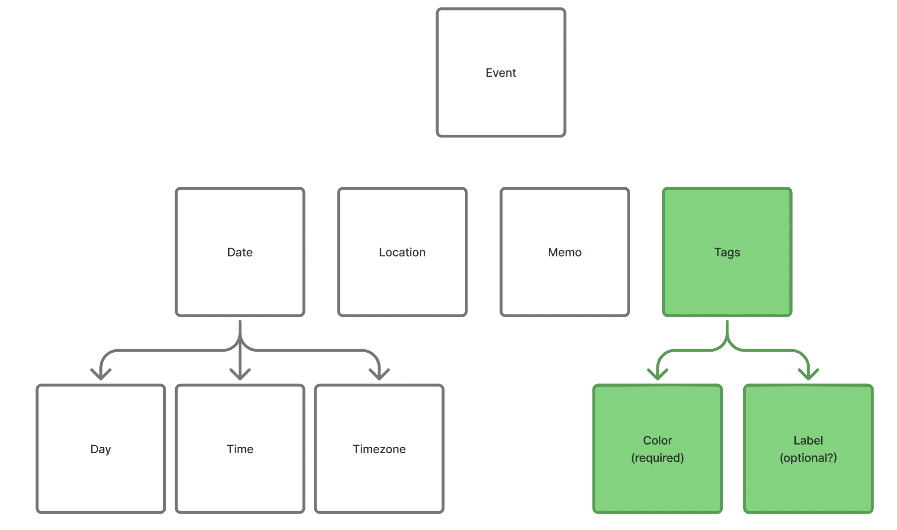
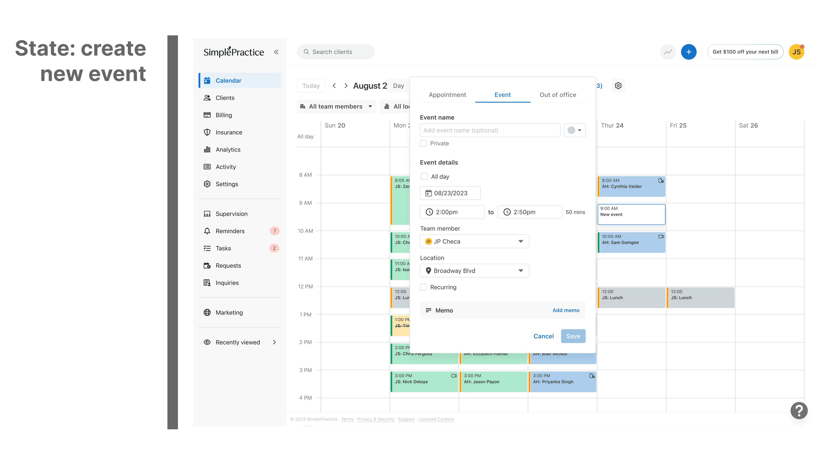
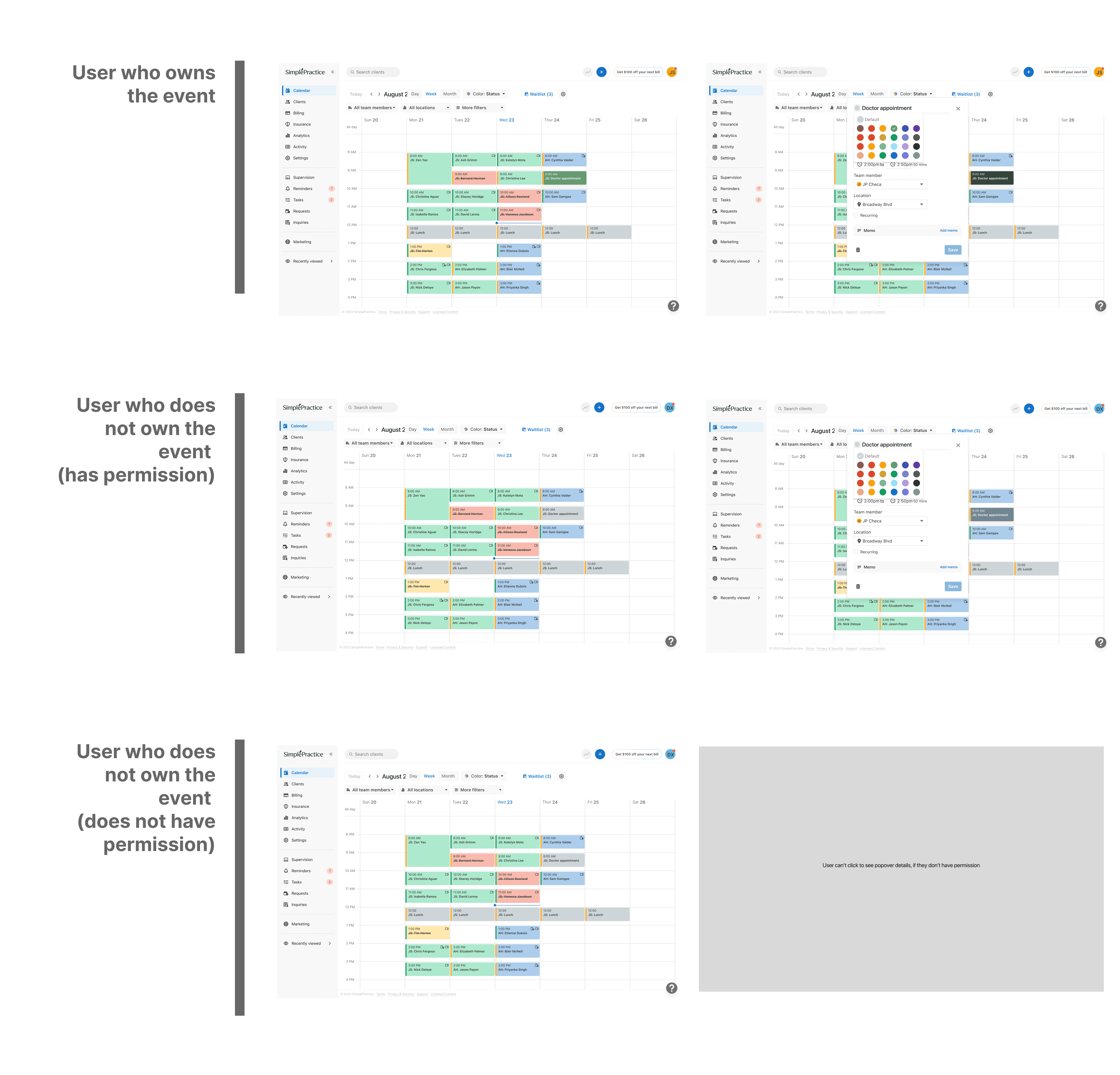
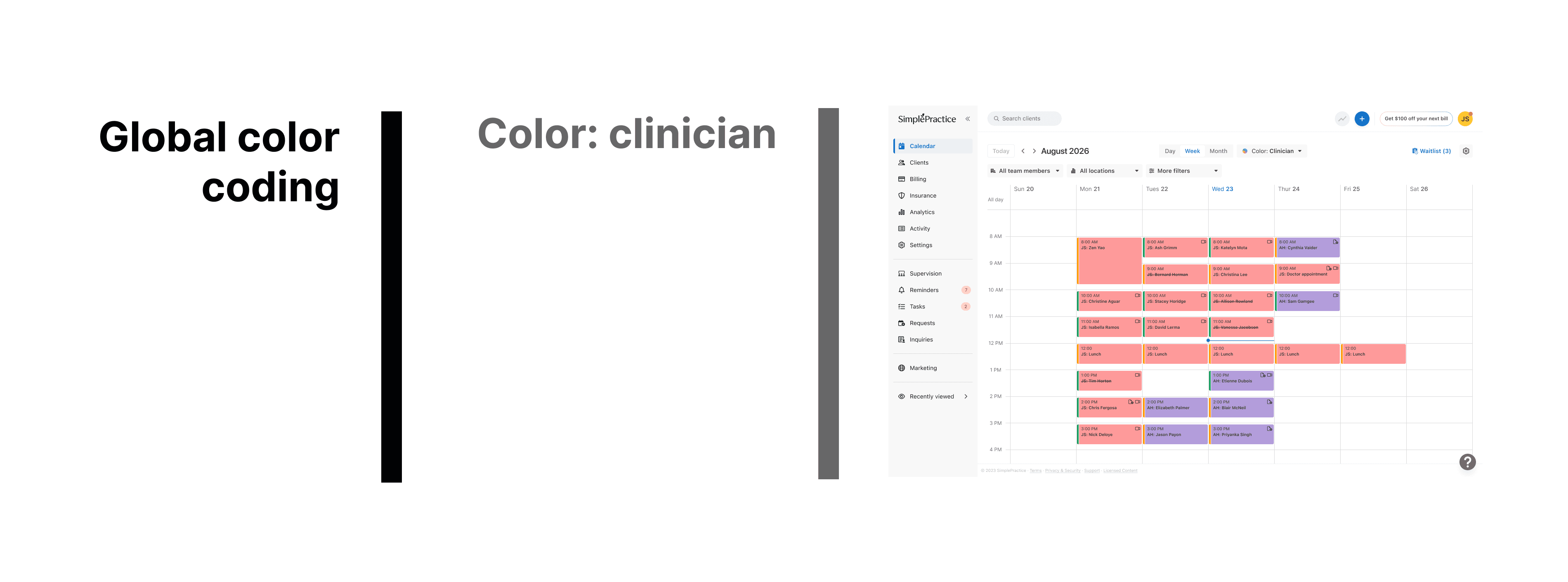
The events flyout, which previously included only the date, location, and memo, would now include colour tags as well.
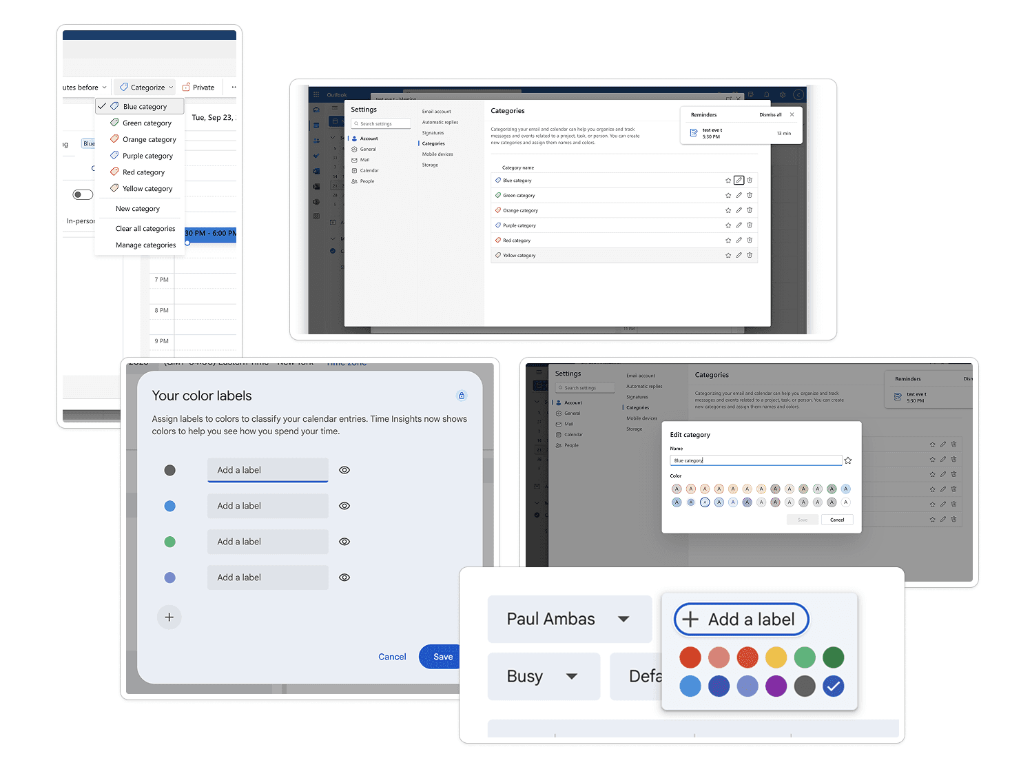
then we looked at how everyone else was handling it
Worked on design explorations and multiple flows
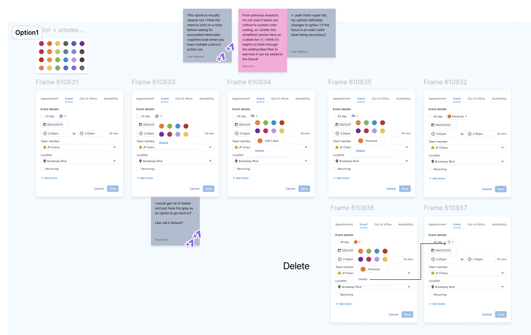
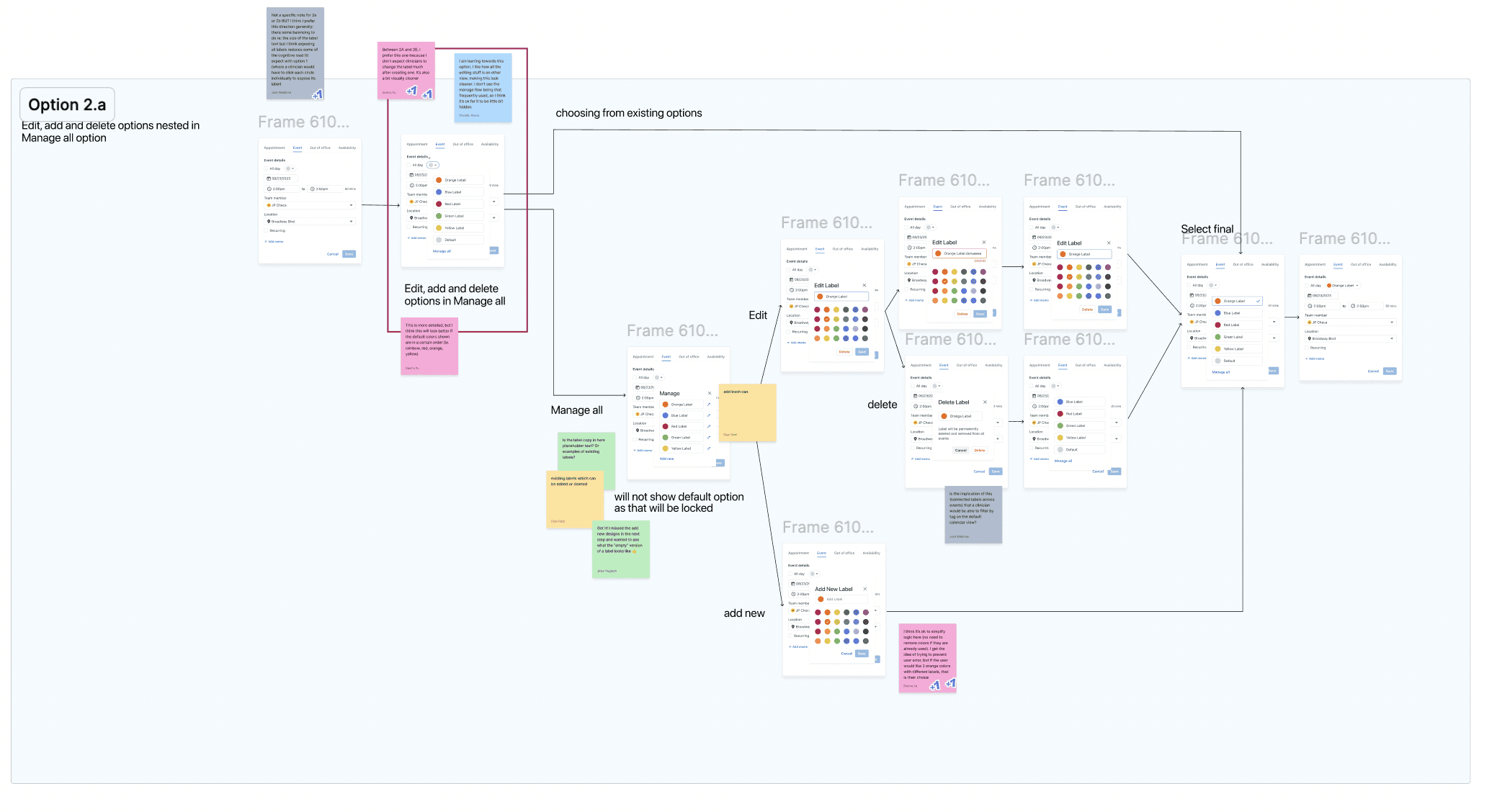
and then we finally landed on these:
Final Designs
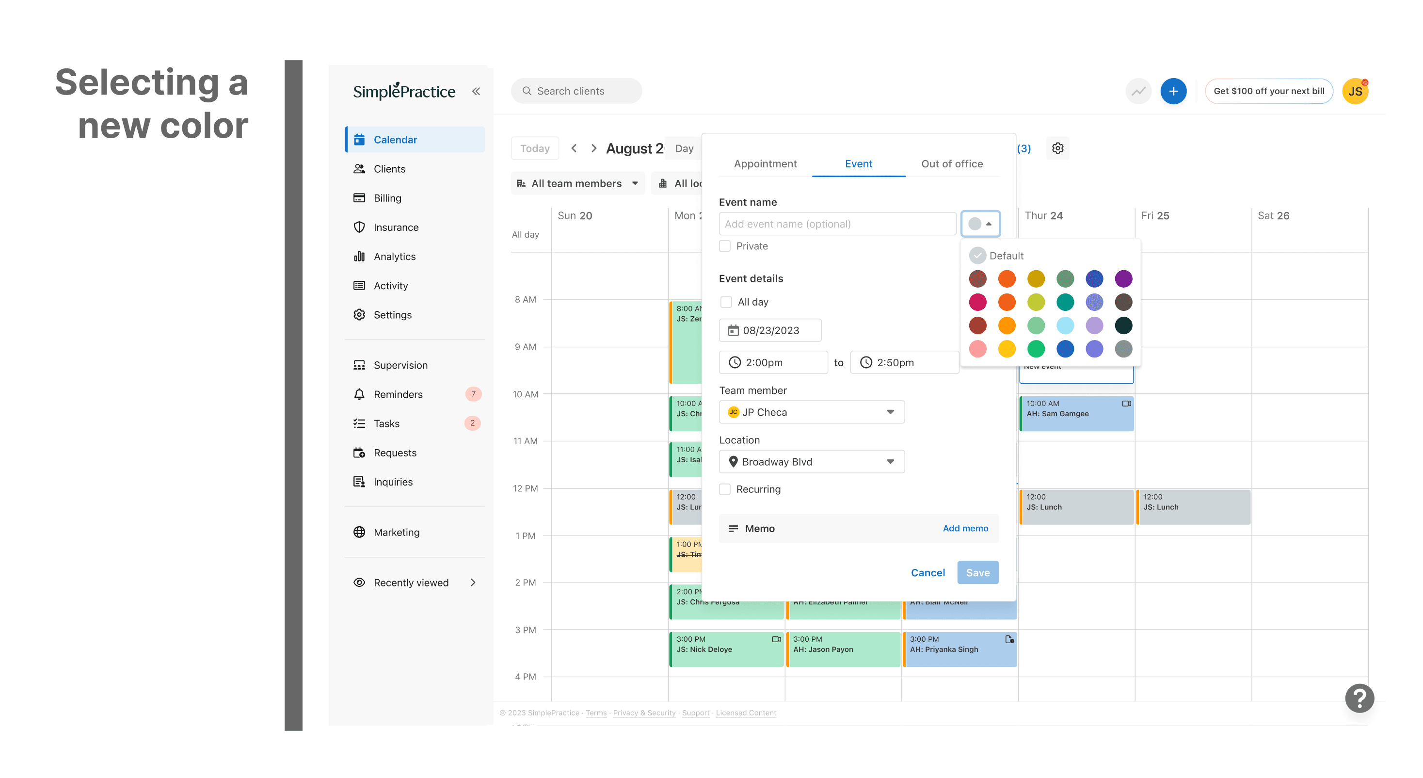
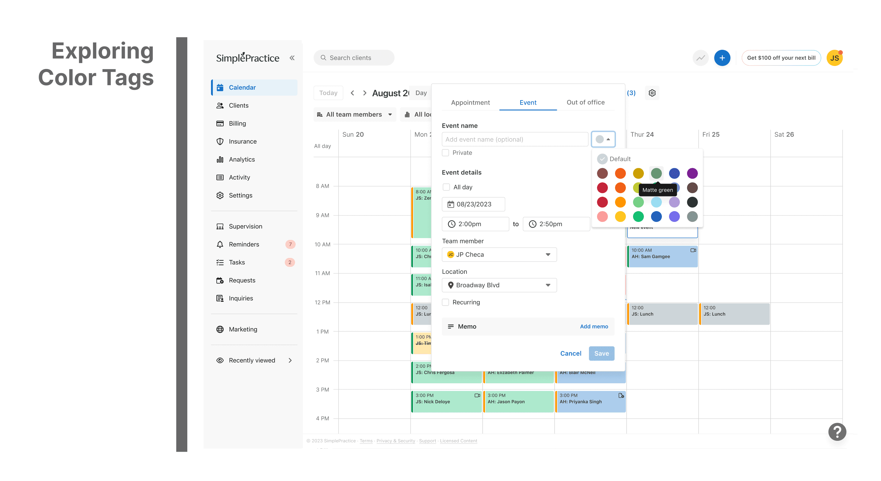
Updated Color Specs
Since it was a new feature, added "new" tag

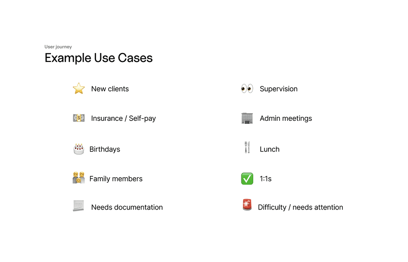
Different Case Scenarios
What Global Color Coding would look like
What my PM and peers had to say about me

Paul Ambas
Product Manager @SimplePractice
"I had the opportunity to work closely with Diya on the Calendar squad at SimplePractice where I led product and she owned design across several initiatives. As a PM, what stood out immediately was her strong product intuition- she consistently approached design problems with a clear understanding of user needs, product goals, and technical constraints. Diya has a rare ability to take ambiguous ideas and quickly translate them into thoughtful, intuitive experiences that help teams move forward with clarity. She was a fantastic partner to work with - proactive, highly collaborative with engineering, and always pushing the team toward better product decisions. Any product team would be fortunate to have Diya as a designer."

Dianna XU
Senior Product Designer @ SimplePractice
"I worked with Diya on the Calendar Squad at SimplePractice, where she quickly tackled end-to-end projects with the product team and adapted rapidly in an ambiguous environment. What stood out most was her openness to feedback and exploration, and her genuine thoughtfulness regarding the user experience during every iteration. I highly recommend Diya for her excellent dedication and growth mindset."
Let's Chat.
Last Updated Jan 2026
Quick Links
Diya Patel
Made by
Open for Full time Opportunities/ Contract Positions